
When you think about decorating your child’s bedroom, you probably think about furniture, storage, cute bedlinen… but what about colour? The colours you choose for a child’s space can have a powerful impact on their mood, energy, and even sleep quality.
At Brightkind, we believe in the magic of colour—used with care and intention. Here’s how colour psychology plays a role in children’s bedrooms, and how to use it to create a space that feels just right for your little one.
Why Colour Matters
Children are incredibly sensitive to their environments. Colours can influence how calm, focused, or energetic they feel. Whether it’s the wall paint, bedding, or art on the walls, colour choices can subtly shape how your child feels in their space.
Let’s take a look at some common colour choices and the moods they tend to evoke:
Blues – Calming, peaceful, good for sleep
Blues are often associated with calm and rest. Pale, soft blues can help reduce anxiety and are perfect for kids who are easily overstimulated. Just be careful with cooler tones that feel too chilly—balance them with warm wood tones or soft textures.
Greens – Balancing, restful, connected to nature
Green is a peaceful, grounding colour that promotes focus and calm. It’s ideal for children who need help winding down or concentrating. Think sage, olive, or soft mint tones.
Yellows – Cheerful, energising, great for play
A pop of yellow brings sunshine into a space—great for boosting mood and encouraging creativity. Stick to softer shades like buttery pastels or mustard for warmth, rather than bright neon tones that can feel overwhelming.
Pinks – Nurturing, gentle, loving
Soft pinks can make a space feel safe and comforting. They’re especially lovely in combination with natural tones, whites, or dusty hues. Brighter pinks can feel high-energy, so use sparingly if your child is easily excitable.
Oranges – Warm, social, creative
A touch of peach or apricot adds warmth and invites interaction. Orange is often linked with confidence and creativity—great in play spaces or art corners, though best used in accents rather than all over.
Purples – Imaginative, soothing, magical
Lavender and lilac shades are dreamy and calming, perfect for a sleep space with a touch of whimsy. Richer purples can feel luxurious but might be too intense for everyday use.
Neutrals & Whites – Fresh, versatile, timeless
Natural whites, creams, and beiges create a clean canvas. They work beautifully as a base, letting colour accents—like art prints or textiles—shine. Just be sure to add texture and warmth so the room still feels cosy and kid-friendly.
Using Colour in a Balanced Way
You don’t have to repaint the entire room to shift the mood. Small changes can make a big impact:
- Add a colourful rug or curtains
- Rotate in seasonal bedding or cushions
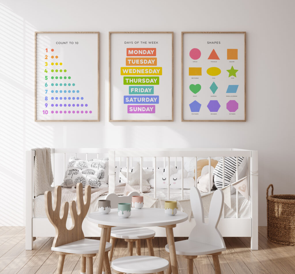
- Introduce educational art prints with gentle colour palettes
- Use removable wall decals or posters for easy updates
Brightkind posters are designed with this in mind—using thoughtful colour palettes that support learning and joy without overwhelming the senses.
What’s the Right Colour for Your Child?
Every child is different. Some are naturally high energy and benefit from cool, calming tones. Others might need a little boost of brightness to feel inspired and engaged.
When choosing colours, ask yourself:
- Does my child sleep well in this space?
- Do they feel calm and settled here?
- Are there areas that feel too chaotic or overstimulating?
Use your observations to guide your palette, and remember: your child’s room doesn’t have to match a trend—it just has to feel like them.
Colour is a simple yet powerful tool for creating bedrooms that feel peaceful, playful, and personal. With the right tones, you can design a space that supports your child’s mood, learning, and wellbeing—while still looking beautiful.
Looking to bring a little colour into your child’s world?
Discover our range of art prints designed to brighten hearts and minds →